/cbre_logo.png?sfvrsn=eac6e070_4)
CBRE EA’s Use of Python Mapping and Uber H3: A Series Examining Phoenix, AZ
Behind the scenes, CBRE Econometric Advisors (EA) started exploring the usefulness of Uber hexagons, available in the H3 python library, to provide a more detailed analysis of logistics markets. This technique involves extracting data from our proprietary database, tagging buildings to corresponding hexagons, aggregating the information at the hexagon level, and displaying it on a map using Python’s Plotly Library and Choropleth to create color coded hexagons that resemble heatmaps. These maps not only offer valuable insights, but also present a beautiful and flexible way to seamlessly blend geospatial observations with data science and econometrics techniques.
To demonstrate the power of this technique, we are producing a series of maps illustrating the Phoenix logistics market. These maps aim to explain the underlying market structure. This series demonstrates CBRE EA's technological capabilities and how 35 years of real estate data can be used to show long-term trends in this market. We chose Phoenix, the 12th largest EA Tier 1 logistics market, as it’s growing fast and is on the verge of surpassing Northern New Jersey and Detroit, which would secure Phoenix a spot among the top 10 logistics markets.
INTRODUCTION TO EA’S USE OF PYTHON MAPPING AND UBER H3
Before we discuss Phoenix, it’s important to provide some background information on the Uber H3 library. Uber offers documentation here about the indexing system it uses to set ride pricing and determine routes. The system allows Uber to create hexagons of 16 different sizes, referred to as resolutions. This allows us to draw global geographic comparisons ranging in granularity from general to specific. It’s a fixed system that allows the user to expect like results when analyzing the same geographical area at the same resolution. To establish boundaries for our analysis we align with the U.S. Office of Management and Budget (OMB) which is used by the U.S. Census. This gives us a host of additional demographic data to which we can tie our real estate database.

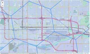
In Python, we can utilize the “polyfill” command from the H3 library to subdivide the area into hexagons. The result above is at resolution 7. Because this resolution is fairly granular, we have zoomed in around the airport area to highlight the difference in size between resolution 7 and resolution 6 hexagons:


Different resolutions are useful for different use cases and might be advisable for different sectors of the real estate market depending on building population density. Building density informs not just the maps resolutions but also our choice of key indicators and the underlying aggregations. Density becomes the key measure informing visualization using Python Plotly Express and choropleth mapbox to produce a heatmap.
Stay tuned for the first map coming soon.
By Franz Limoges and Nicholas Rita
What's Next?
Watch Now: 2024 Outlook WebinarAccess the recording of our latest quarterly webinar held Thursday, December 14. |
Locator DataViews Training Guide
Interested in learning more about our Locator tool? Access the training guide and learn how to best leverage the tool. |
CBRE Insights & Research
The places in which we live, work and invest will continue to change and adapt to technology, demographics and human expectations at an accelerated rate. |


